

CSS Units Converter
Understanding CSS Units CSS units are the building blocks for defining sizes and spacing in web design. They come in two main types: absolute and relative. Absolute units like px represent fixed sizes, while relative units such as em , rem , and viewport units…
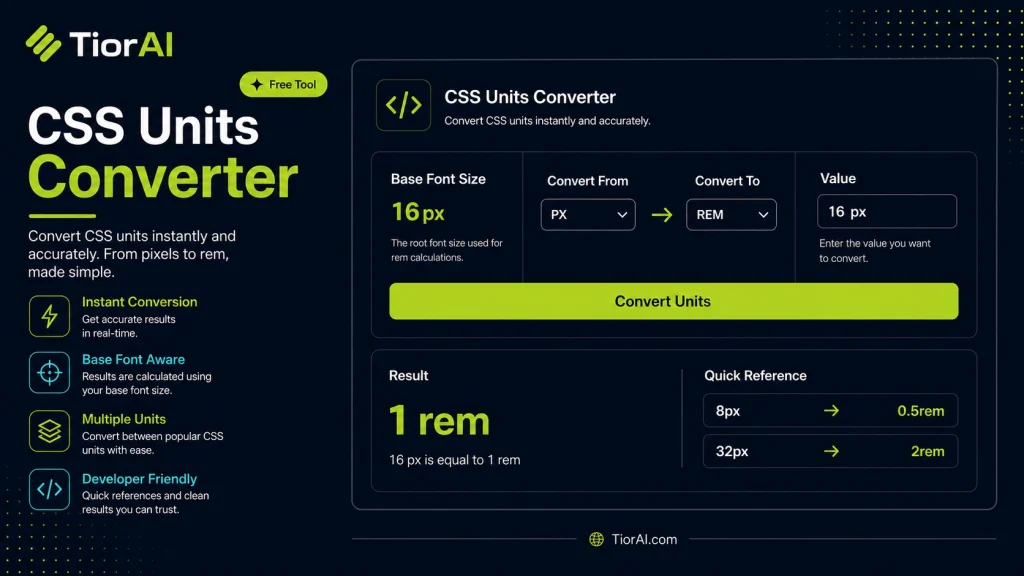
How to use it
- Paste or Enter Your Input Paste your code, text, or data into the input field. The tool supports large inputs without performance issues.
- Process and Analyze Click the action button or let the tool auto-process your input. Results appear in real time with highlighted details.
- Copy or Download the Output Review the results and copy the output to clipboard or download as a file for use in your project.
Tip For large inputs, process in sections to validate intermediate results and catch errors early.
Understanding CSS Units
CSS units define the measurement values used in styling web elements, such as widths, heights, margins, paddings, font sizes, and more. These units allow developers to specify sizes in absolute or relative terms, affecting how elements render across different devices and screen sizes.
Absolute units include px (pixels), cm (centimeters), mm (millimeters), in (inches), pt (points), and pc (picas). These units represent fixed sizes regardless of other factors. For example, px is the most common absolute unit, representing a single pixel on the screen.
Relative units adapt based on context. Common relative units include em, rem, vw, vh, %, and vmin/vmax. For instance, em is relative to the font size of the parent element, while rem is relative to the root element’s font size. Viewport units like vw and vh are relative to the viewport’s width and height, respectively.
Using the right CSS units is crucial for responsive design and accessibility. For example, using rem for font sizes allows users to scale text easily by adjusting the root font size, improving readability. Viewport units help create layouts that adapt fluidly to different screen sizes.
The CSS Values and Units Module Level 3 specification (W3C) defines these units and their behavior. Developers rely on these standards to ensure consistent rendering across browsers.
Converting between CSS units is often necessary when adapting designs or debugging styles. For example, converting px to em requires knowing the base font size, while converting viewport units to pixels depends on the current viewport dimensions. A CSS units converter tool automates these calculations, saving time and reducing errors.
Understanding CSS Units
CSS units are the building blocks for defining sizes and spacing in web design. They come in two main types: absolute and relative. Absolute units like px represent fixed sizes, while relative units such as em, rem, and viewport units adapt based on context.
Absolute units are straightforward but can limit responsiveness. For example, specifying a width of 300px will always render as 300 pixels, regardless of screen size or user settings. This can cause issues on smaller devices or when users zoom in.
Relative units solve this by scaling elements dynamically. em units are relative to the font size of the parent element, which means nested elements can compound sizes unintentionally. rem units reference the root font size, providing a stable baseline for scaling. Viewport units like vw and vh relate to the viewport’s dimensions, enabling fluid layouts that adjust to screen size.
When to Use a CSS Units Converter
- When you need to convert fixed pixel values to relative units like
emorremfor better scalability and accessibility. - When adapting desktop designs to mobile by translating pixel measurements into viewport units for responsive layouts.
- When debugging CSS and trying to understand how different units translate to actual sizes on various devices.
Common Mistakes with CSS Units
- Mixing up
emandremunits, leading to unexpected sizing due to their different reference points. - Misunderstanding viewport units as fixed sizes rather than percentages of the viewport, which can cause layout issues on resizing.
Understanding these nuances helps developers create flexible, accessible, and maintainable stylesheets. Using a CSS units converter tool simplifies the process of switching between units, ensuring accurate and consistent results across projects.
Common use cases
- Convert 16px to rem with a root font size of 16px
- Convert 50vw to pixels on a 1200px wide viewport
Frequently asked questions
px is an absolute unit representing pixels on the screen. em is relative to the font size of the parent element, so it can compound if nested. rem is relative to the root element's font size, providing a consistent reference regardless of nesting.vw and vh represent percentages of the viewport's width and height, respectively. They are useful for creating responsive layouts that scale with the browser window size.width: calc(100% - 50px);. However, mixing units without calc() is generally invalid.em is relative to the font size of the parent element, its pixel value changes depending on the parent's font size. This can lead to compounding effects in nested elements.rem is often preferred for font sizing because it provides a consistent reference point based on the root font size, making scaling predictable. em can be useful for components that need to scale relative to their container.Reviews and questions
Whether this tool gave people the answer they needed, and what they asked about it.
Sign in to review this tool.
Sign In to ReviewNo reviews yet
Be the first to say whether this tool gave you what you needed.
Ask how to read the result, or what the tool does with an edge case — or answer someone else.
Sign In to AskNo questions yet
Not sure how to read a result? Be the first to ask.
AI tools related to this topic
Tools from the TiorAI directory that work on the same kind of job.

ChatGPT
ChatGPT is an AI chatbot by OpenAI powered by GPT-4o. It handles writing, coding, research, data analysis, and natural conversation. Free tier available, Plus at $20/month.