

From my experience exploring YACSS, I appreciate its focus on minimalism and speed. It excels at providing a straightforward atomic CSS approach that helps build responsive layouts without the overhead of larger frameworks. This makes it particularly well-suited for developers who want to keep their projects lightweight and fast-loading. However, the trade-off is that YACSS has a smaller community and less extensive documentation compared to more established frameworks, which might require some self-guided learning. Overall, if you need a simple, no-frills CSS utility framework for rapid and efficient styling, YACSS delivers solid results.
YACSS - Lightweight CSS Framework for Fast Responsive Web Design
YACSS is a lightweight atomic CSS framework that provides utility classes for fast and responsive web design without JavaScript dependencies.
- Best for
- Responsive Web Design
- Key capability
- Atomic CSS Architecture

Do you recommend this tool?
What is YACSS?
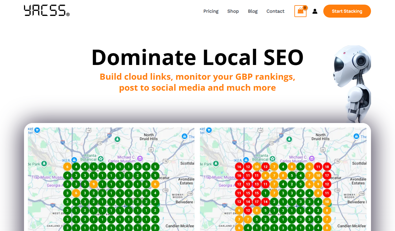
YACSS (Yet Another CSS) is a lightweight, atomic CSS framework designed to provide a minimalistic and fast approach to styling web pages. It offers a set of utility classes that enable developers to build responsive and clean user interfaces without the complexity or size of larger CSS frameworks.
Key features of YACSS
YACSS features a modular atomic CSS architecture, responsive utilities, and a minimal footprint that helps developers create fast-loading and maintainable web designs. It emphasizes simplicity and performance, making it ideal for projects where lightweight styling is a priority.
Atomic CSS Architecture
Provides single-purpose utility classes for styling, promoting reusability and reducing CSS bloat.
Responsive Utilities
Includes classes that adapt styles based on screen size for mobile-friendly designs.
Minimal File Size
Designed to be lightweight, ensuring faster load times and better performance.
Easy to Learn and Use
Simple class naming conventions make it accessible for developers of all skill levels.
Pros and cons of YACSS
Pros
- Extremely lightweight and fast
- Simple and intuitive utility classes
- Responsive design support out of the box
- No JavaScript dependency
Cons
- Limited documentation compared to larger frameworks
- Smaller community and ecosystem
Key use cases for YACSS
Responsive Web Design
Create responsive layouts that adapt seamlessly to different screen sizes using YACSS's utility classes.
Rapid Frontend Prototyping
Quickly prototype web interfaces with minimal CSS overhead and straightforward class naming.
Lightweight Styling for Web Projects
Implement clean and minimal styling without the bloat of large CSS frameworks.
Customizable CSS Architecture
Use YACSS's modular and atomic CSS approach to build scalable and maintainable stylesheets.
How YACSS works
- 1
Include YACSS in Your Project
Add the YACSS stylesheet via CDN or download it to your project directory.
- 2
Apply Utility Classes
Use YACSS’s predefined atomic classes directly in your HTML elements to style them.
- 3
Customize as Needed
Extend or override styles by adding your own CSS or modifying YACSS variables if applicable.
Who is using YACSS
Frontend developers
Web designers
Developers building lightweight websites
Prototyping specialists
Performance-focused web projects
YACSS pricing
Free
$0
Full access to all YACSS features with no cost.
Plans and prices are as published by the vendor and can change. Check the official site before you buy. Open the pricing page (opens in a new tab)
Frequently asked questions about YACSS
Yes, YACSS can be used alongside other CSS frameworks, but care should be taken to avoid class name conflicts.
No, YACSS is a pure CSS framework and does not depend on JavaScript.
Yes, you can override or extend YACSS styles by adding your own CSS.
This tool is designed to help users accomplish its core tasks more efficiently. It is typically used by individuals or teams looking to improve productivity and workflow.
Some tools offer a free plan or trial with limited features. Availability can vary, so confirm on the official website.
The best alternative depends on your workflow, features you need, and budget. Compare plans, integrations, and output quality to choose the closest fit.
Sign in to review this tool.
Sign In to ReviewNo reviews yet
Be the first to share how this tool worked for you.
Ask about pricing, limits, or how it compares — or answer someone else.
Sign In to AskNo questions yet
Have a question about using or paying for this tool? Be the first to ask.
Featured on TiorAI



Alternative Tools
Explore similar AI tools that might fit your needs

Free
Bootstrap
Bootstrap is a free, open-source front-end framework that helps developers build responsive, mobile-first websites quickly using a grid system, pre-styled UI components, and JavaScript plugins.

Free
Bulma
Bulma is a free, open-source CSS framework based on Flexbox that helps developers build responsive, mobile-friendly websites quickly without JavaScript dependencies.
More AI Album Cover Generator tools
Other tools in the same category, for when this one is not quite the fit.

Enterprise
qdrant.io
Qdrant is an open-source vector search engine that enables scalable, real-time semantic search and AI-powered applications by efficiently managing and querying high-dimensional vector data.

Free Trial
Packify.ai
Packify.ai is an AI-driven online tool that helps users design custom product packaging with 3D mockups and direct ordering.

Free Trial
Opus
Opus AI is an AI-powered video creation tool that automates video editing and generation from scripts or raw footage, designed for marketers and content creators.

Free
Postly
Postly is an AI-driven social media scheduling platform that automates posting and offers content suggestions to streamline social media management.
Freemium
AMBLR – AI Travel Planner
AMBLR is an AI-powered travel planner that creates personalized trip itineraries based on your preferences, travel dates, and budget, helping you plan multi-destination trips with budget estimates and customizable plans.
Free
simbla-sites.com
Simbla is a cloud-based website builder offering an intuitive drag-and-drop editor, responsive templates, database creation, and e-commerce features, enabling users to build professional websites without coding.

Free Trial
Novo AI
Novo AI is a web-based platform that uses artificial intelligence to automate video creation, enabling marketers and content creators to produce professional marketing videos quickly without advanced editing skills.

Freemium
mycvcreator.com
MyCVCreator is an online platform that helps users create professional resumes and cover letters using customizable templates, supporting multiple languages and offering both free and premium plans.