

From my experience with Datawrapper, I found it excels at making data visualization accessible to users without technical backgrounds. Its intuitive interface and variety of chart and map options allow quick creation of clear, interactive visuals that engage audiences effectively. This tool is particularly well-suited for journalists, marketers, and educators who need to communicate data stories without complex software. However, the free plan’s branding and limited advanced analytics may be a drawback for some professional users. Overall, if you want a straightforward, web-based solution for interactive charts and maps, Datawrapper delivers reliable and user-friendly results.
Datawrapper Data Visualization Tool for Interactive Charts and Maps
Datawrapper is a web-based tool that allows users to create interactive charts, maps, and tables from data without coding, ideal for journalists, marketers, and educators.
- Best for
- Journalism and Newsrooms
- Key capability
- Wide Range of Chart Types
Do you recommend this tool?
What is Datawrapper?
Datawrapper is a web-based data visualization tool that enables users to create interactive charts, maps, and tables without coding. It is designed to help journalists, marketers, educators, and analysts turn raw data into clear, engaging visual stories that can be embedded on websites or shared online.
Key features of Datawrapper
Datawrapper offers an intuitive drag-and-drop interface, a variety of chart types, customizable map visualizations, responsive design for mobile devices, and easy embedding options. It supports data uploads from CSV, Excel, and Google Sheets, and provides options for branding and styling to match organizational identity.
Wide Range of Chart Types
Includes bar, line, pie charts, scatter plots, and more for versatile data representation.
Interactive Maps
Create choropleth and symbol maps with customizable regions and tooltips.
No Coding Required
User-friendly interface designed for non-technical users to build visualizations quickly.
Responsive and Embeddable
Visualizations adapt to different screen sizes and can be embedded seamlessly.
Branding and Customization
Options to add logos, custom colors, and fonts to match organizational style.
Pros and cons of Datawrapper
Pros
- Easy to use with no coding required
- Supports a wide variety of chart and map types
- Responsive and embeddable visualizations
- Good customization and branding options
- Strong focus on journalistic and business use cases
Cons
- Limited advanced analytics features
- Free plan includes Datawrapper branding
- No desktop or offline version available
Key use cases for Datawrapper
Journalism and Newsrooms
Create interactive charts and maps to visualize data stories for news articles and reports.
Business Reporting
Generate clear and engaging visual reports and dashboards to communicate business metrics.
Education and Research
Visualize complex datasets for presentations, papers, and teaching materials.
Marketing and Social Media
Design shareable and interactive data visualizations to enhance marketing campaigns and social posts.
Public Sector and NGOs
Publish transparent and accessible data visualizations for public information and advocacy.
How Datawrapper works
- 1
Upload Data
Import your dataset via CSV, Excel, or Google Sheets into the platform.
- 2
Choose Visualization Type
Select from charts, maps, or tables based on your data and storytelling needs.
- 3
Customize Design
Adjust colors, labels, fonts, and layout to fit your brand and improve clarity.
- 4
Publish and Share
Embed your visualization on websites or share direct links with interactive features.
Who is using Datawrapper
Journalists and news organizations
Marketing teams and agencies
Business analysts and managers
Educators and researchers
Nonprofits and public sector communicators
Datawrapper pricing
Free
$0/month
Basic features with Datawrapper branding and limited export options.
Custom
Contact for pricing
Advanced features, white-labeling, team collaboration, and priority support.
Plans and prices are as published by the vendor and can change. Check the official site before you buy. Open the pricing page (opens in a new tab)
Frequently asked questions about Datawrapper
Yes, Datawrapper is designed for users without programming knowledge, offering an intuitive drag-and-drop interface.
You can upload data in CSV, Excel, and Google Sheets formats.
Yes, all charts and maps created with Datawrapper are responsive and adapt to mobile devices.
Removing branding is available in paid plans with white-label options.
Data handling and security practices vary by provider. Review the official privacy policy to understand how your data is stored and used.
Some tools offer a free plan or trial with limited features. Availability can vary, so confirm on the official website.
Data handling and security practices vary by provider. Review the official privacy policy to understand how your data is stored and used.
Data handling and security practices vary by provider. Review the official privacy policy to understand how your data is stored and used.
Sign in to review this tool.
Sign In to ReviewNo reviews yet
Be the first to share how this tool worked for you.
Ask about pricing, limits, or how it compares — or answer someone else.
Sign In to AskNo questions yet
Have a question about using or paying for this tool? Be the first to ask.
Featured on TiorAI



Alternative Tools
Explore similar AI tools that might fit your needs

Free
Infogram
Infogram is a web-based platform that allows users to create interactive infographics, charts, and reports using customizable templates and live data integration without coding skills.

Free
ChartBlocks
ChartBlocks is an online platform that enables users to create, customize, and share a wide variety of charts without coding, supporting data import from multiple sources and offering export options for reports and web embedding.
More AI Content Generator tools
Other tools in the same category, for when this one is not quite the fit.
Custom Pricing
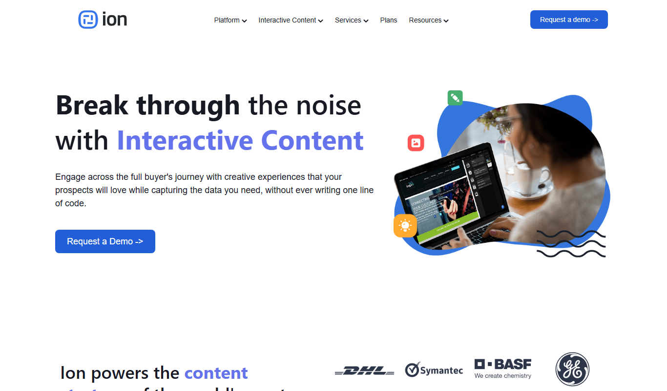
Ion Interactive
Ion Interactive is a web-based platform that enables marketers to create interactive content like quizzes and assessments to engage audiences and generate leads without coding.
Freemium
简道云内容助手
Jiandaoyun Content Assistant is an AI writing tool embedded in a no-code platform that helps users generate and automate content creation, primarily for Chinese language users.

Free
写作猫AI
写作猫AI is a Chinese-language AI writing assistant that supports content generation, creative writing, and text refinement through a web platform.
Free
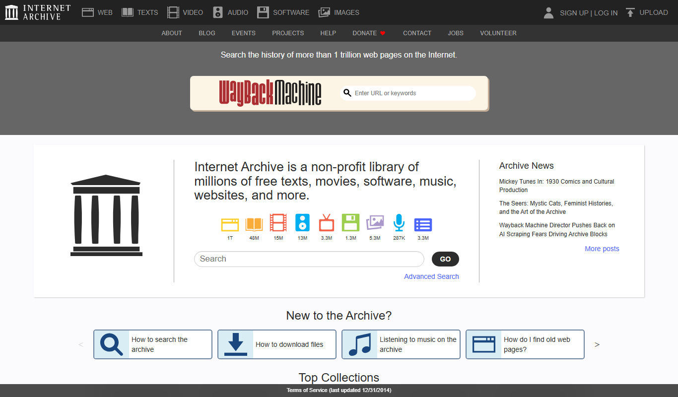
Internet Archive
Internet Archive is a free nonprofit digital library offering millions of books, audio, video, and archived websites accessible online through its web platform and the Wayback Machine.

Freemium
Simpleclub
Simpleclub is an educational platform providing interactive video lessons and personalized learning tools primarily for secondary school students, helping them understand school subjects and prepare for exams.

Free
Calmly Writer
Calmly Writer is a minimalist writing app designed to help users focus by providing a distraction-free interface, Markdown support, autosave, and export options. It is available as a free web app and a paid desktop app for offline use.

Free
Fighting Fantasy
Fighting Fantasy is a web-based interactive story platform that lets users play and create branching narrative gamebooks inspired by the classic Fighting Fantasy series, incorporating RPG elements like dice rolls and character stats.

Free
Spreadsheeto
Spreadsheeto is an online platform offering detailed Microsoft Excel tutorials and courses to help users from beginners to advanced professionals improve their spreadsheet skills.