

From my experience with Graphy for Data Storytelling, I found it excels at making complex data accessible through interactive and visually engaging presentations. Its drag-and-drop interface lowers the barrier for non-technical users to create compelling data narratives. After spending time with the platform, I can say it’s particularly well-suited for business analysts, journalists, and educators who need to communicate insights clearly. However, the reliance on web connectivity and some advanced features being locked behind paid plans are trade-offs to consider. Overall, if you want to transform raw data into interactive stories without coding, Graphy delivers solid and user-friendly results.
Graphy Data Storytelling Platform for Interactive Visual Analytics
Graphy is a web platform that enables users to create interactive data stories and visualizations through an easy drag-and-drop interface, supporting real-time data integration and sharing.
- Best for
- Interactive Data Presentations
- Key capability
- Interactive Charts

Do you recommend this tool?
What is Graphy for Data Storytelling?
Graphy is a web-based data storytelling platform that empowers users to create interactive, visually appealing data narratives. It combines data visualization with storytelling techniques to help businesses, educators, and journalists communicate insights effectively. Users can build interactive charts, dashboards, and presentations without coding, making complex data accessible and engaging.
Key features of Graphy for Data Storytelling
Graphy offers a suite of features including drag-and-drop chart creation, customizable templates, real-time data integration, and interactive storytelling components. It supports embedding visualizations into websites or sharing them as standalone presentations, enhancing audience engagement.
Interactive Charts
Build a variety of charts that respond to user input for deeper data exploration.
Drag-and-Drop Editor
Intuitive interface that requires no coding skills to create complex visualizations.
Real-Time Data Integration
Connect live data sources to keep visualizations updated automatically.
Customizable Templates
Pre-built templates that can be tailored to fit different storytelling needs.
Sharing and Embedding
Easily share stories via links or embed them into websites and blogs.
Pros and cons of Graphy for Data Storytelling
Pros
- User-friendly drag-and-drop interface
- Supports real-time data updates
- Wide variety of interactive chart types
- Flexible sharing and embedding options
- Customizable templates speed up creation
Cons
- Limited offline functionality as it is web-based
- Advanced features require paid subscription
- Currently supports only English language
Key use cases for Graphy for Data Storytelling
Interactive Data Presentations
Create engaging and interactive presentations that visualize complex data clearly for stakeholders.
Business Reporting
Build dynamic reports with real-time data updates to monitor business performance effectively.
Data Journalism
Enable journalists to craft compelling stories backed by interactive visual data elements.
Educational Content
Design educational materials that simplify data concepts through visual storytelling for learners.
Marketing Analytics
Visualize marketing campaign data to communicate insights and trends to teams and clients.
How Graphy for Data Storytelling works
- 1
Sign Up
Create a free account on Graphy’s website to access the platform.
- 2
Import Data
Upload datasets or connect to live data sources to begin building visualizations.
- 3
Create Visual Story
Use drag-and-drop tools to design interactive charts and arrange them into a narrative flow.
- 4
Customize and Publish
Adjust styles, add annotations, and publish your story to share via link or embed on websites.
Who is using Graphy for Data Storytelling
Data analysts and business intelligence professionals
Journalists and content creators
Educators and trainers
Marketing teams
Small to medium businesses
Graphy for Data Storytelling pricing
Free
$0/month
Access to basic features with limited projects and public sharing.
Pro
$15/month
Advanced features including private projects, more storage, and priority support.
Enterprise
Custom pricing
Tailored solutions with dedicated support, team collaboration, and enhanced security.
Plans and prices are as published by the vendor and can change. Check the official site before you buy. Open the pricing page (opens in a new tab)
Frequently asked questions about Graphy for Data Storytelling
Yes, Graphy is designed with a drag-and-drop interface that requires no programming knowledge.
Graphy supports CSV, Excel files, and connections to live data sources like APIs.
Yes, you can embed interactive stories directly into your website or blog.
Team collaboration is available in the Enterprise plan with shared projects and permissions.
This tool is designed to help users accomplish its core tasks more efficiently. It is typically used by individuals or teams looking to improve productivity and workflow.
Data handling and security practices vary by provider. Review the official privacy policy to understand how your data is stored and used.
Yes, it can help with that use case depending on how you configure it and what features are available. You’ll get the best results with clear inputs and a defined goal.
Sign in to review this tool.
Sign In to ReviewNo reviews yet
Be the first to share how this tool worked for you.
Ask about pricing, limits, or how it compares — or answer someone else.
Sign In to AskNo questions yet
Have a question about using or paying for this tool? Be the first to ask.
Featured on TiorAI



Alternative Tools
Explore similar AI tools that might fit your needs

Free
Flourish
Flourish is a web-based platform that allows users to create interactive charts, maps, and infographics without coding, ideal for data storytelling and business reporting.
Free
Datawrapper
Datawrapper is a web-based tool that allows users to create interactive charts, maps, and tables from data without coding, ideal for journalists, marketers, and educators.
More AI Analytics Assistant tools
Other tools in the same category, for when this one is not quite the fit.

Custom Pricing
Veraset
Veraset provides privacy-compliant, high-quality location data via API and web platform to support marketing, retail, and urban planning analytics.

Custom Pricing
Cambridge Mobile Telematics
Cambridge Mobile Telematics provides a mobile telematics platform that uses smartphone sensors and AI to analyze driver behavior, enabling insurers and fleet managers to assess risk, improve safety, and reduce accidents.
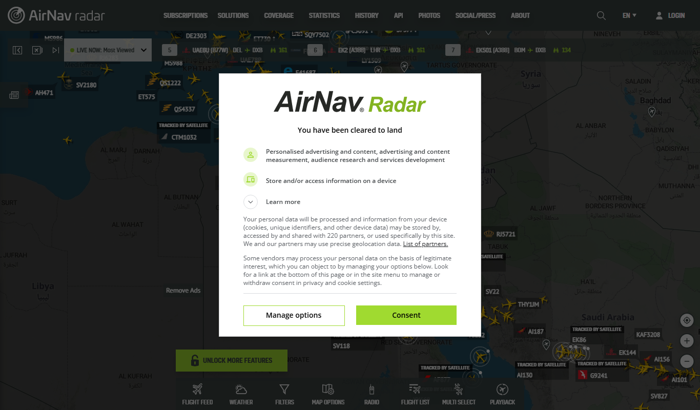
Free
RadarBox
RadarBox is a real-time flight tracking platform offering live aircraft positions, flight history, and aviation data accessible via web and mobile apps.

Free
DeFiChain
DeFiChain is a blockchain platform focused on decentralized finance, enabling fast, secure, and low-cost DeFi applications integrated with Bitcoin.
Custom Pricing
Liquidnet
Liquidnet is a global institutional trading platform that connects asset managers and brokers to execute large block equity trades anonymously via a dark pool, providing liquidity and advanced analytics to optimize trade execution.

Free
Yearn Finance
Yearn Finance is a decentralized finance platform that automates yield farming strategies using smart contracts to maximize returns on Ethereum-based crypto assets.
Free
Stock Rover
Stock Rover is an investment research platform that provides advanced stock screening, portfolio analytics, and comprehensive financial data to help investors analyze and manage their investments effectively.
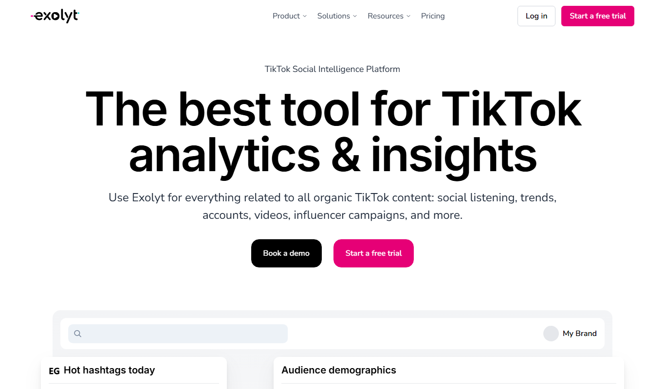
Free
Exolyt
Exolyt is a TikTok analytics tool that helps marketers and influencers track video performance, analyze competitors, and monitor follower growth to optimize TikTok marketing strategies.