

From my experience with The Visualizer, I found it excels at simplifying complex data into clear, actionable visual insights without requiring technical expertise. The AI-driven chart recommendations and interactive dashboards make it easy for business users to explore data and make informed decisions quickly. However, the platform currently supports only English and lacks a mobile app, which could limit accessibility for some users. Overall, if you need a straightforward, AI-powered data visualization tool for business analytics, The Visualizer delivers effective and user-friendly results.
The Visualizer AI Tool for Data Visualization and Insight Generation
The Visualizer is an AI-powered platform that automates data visualization by suggesting charts and creating interactive dashboards to help businesses gain insights without coding.
- Best for
- Business Data Analysis
- Key capability
- Automated Chart Suggestions

What is The Visualizer?
The Visualizer is an AI-powered data visualization platform designed to convert raw data into intuitive, interactive visual dashboards. It helps users quickly generate insights by automating the creation of charts, graphs, and reports without requiring advanced technical skills.
Key features of The Visualizer
The Visualizer offers automated data ingestion, AI-driven chart recommendations, customizable dashboards, and real-time data updates. Its intuitive interface enables users to explore data visually and uncover trends effortlessly.
Automated Chart Suggestions
AI recommends the best visualization types based on data patterns.
Interactive Dashboards
Create dashboards that allow users to drill down and filter data dynamically.
Real-Time Data Updates
Dashboards refresh automatically as new data becomes available.
Easy Data Integration
Supports multiple data sources including CSV, Excel, and cloud databases.
Pros and cons of The Visualizer
Pros
- User-friendly AI-driven visualization recommendations
- Supports multiple data sources with easy integration
- Interactive and customizable dashboards
- Real-time data refresh capabilities
Cons
- Limited language support (English only)
- No mobile app available currently
Key use cases for The Visualizer
Business Data Analysis
Transform complex business data into clear visual insights to support decision-making.
Marketing Performance Tracking
Visualize marketing campaign data to monitor performance and optimize strategies.
Financial Reporting
Create interactive financial dashboards that simplify reporting and trend analysis.
Operational Metrics Monitoring
Track key operational metrics in real-time to improve efficiency and identify issues.
How The Visualizer works
-
1
Connect Data Sources
Import data from spreadsheets, databases, or cloud services to start visualization.
-
2
AI-Powered Visualization
The AI analyzes your data and suggests the most relevant charts and graphs.
-
3
Customize Dashboards
Modify visualizations and arrange them into interactive dashboards tailored to your needs.
-
4
Share and Collaborate
Distribute dashboards with team members or stakeholders for collaborative insights.
Who is using The Visualizer
Business analysts
Marketing teams
Financial professionals
Operations managers
Small to medium enterprises
The Visualizer pricing
Free Trial
$0 for 14 days
Full feature access for two weeks to evaluate the platform.
Professional
$49/month
Access to all features with limits on data volume and users.
Enterprise
Custom pricing
Tailored solutions with advanced support and unlimited data capacity.
Plans and prices are as published by the vendor and can change. Check the official site before you buy. Open the pricing page (opens in a new tab)
Frequently asked questions about The Visualizer
You can connect spreadsheets, CSV files, cloud databases, and other common data sources.
No coding is needed; the AI suggests visualizations and the interface is user-friendly.
Yes, dashboards can be shared with collaborators for real-time insights.
It depends on your specific needs and how you plan to use the tool. The official website and documentation are the best sources for the latest details.
Data handling and security practices vary by provider. Review the official privacy policy to understand how your data is stored and used.
It depends on your specific needs and how you plan to use the tool. The official website and documentation are the best sources for the latest details.
Sign in to review this tool.
Sign In to ReviewNo reviews yet
Be the first to share how this tool worked for you.
Ask about pricing, limits, or how it compares — or answer someone else.
Sign In to AskNo questions yet
Have a question about using or paying for this tool? Be the first to ask.
Featured on TiorAI



More AI Artificial Intelligence Tools tools
Other tools in the same category, for when this one is not quite the fit.
Freemium
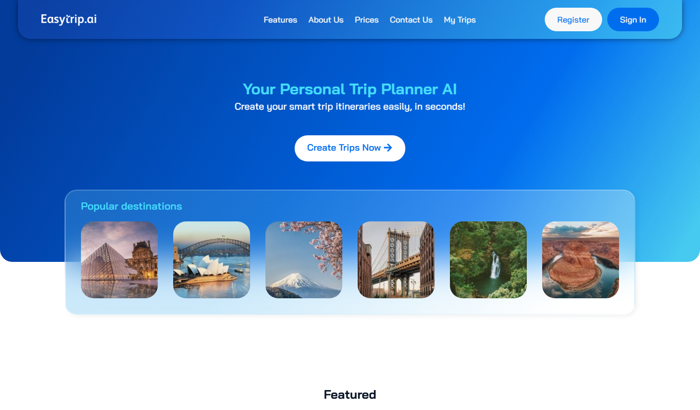
EasyTrip AI
EasyTrip AI is an AI-driven travel planner that generates customized trip itineraries based on your travel dates, destinations, and preferences, helping you organize your trip efficiently.

Freemium
Travel Itinerary AI
Travel Itinerary AI is an AI-powered web tool that creates personalized travel itineraries based on your preferences, helping you plan and manage trips efficiently.

Free
NilgAI Travel
NilgAI Travel is an AI-driven travel planning tool that creates personalized itineraries based on your preferences, travel dates, and budget, helping you efficiently plan trips worldwide.

Custom Pricing
sentiance.com
Sentiance is an AI-powered platform that transforms sensor and contextual data into actionable behavioral insights, enabling businesses to understand user behavior and deliver personalized experiences in real-time.

Contact for pricing
ODESIS
ODESIS is an AI-driven analytics platform that helps businesses transform data into actionable insights through machine learning, visualization, and predictive analytics.

Contact for pricing
QUINETICS
Quinetics is an AI platform that provides businesses with advanced data analytics, workflow automation, and custom machine learning model development to optimize operations and decision-making.

Free
aigclist
AIGCList is a free online directory that aggregates and categorizes AI tools, providing detailed information, user reviews, and AI industry news to help users discover and compare AI solutions.

Free
AI Tool Center
AI Tool Center is a free online directory that helps users discover, compare, and review AI tools across various categories and industries.